WEB DEVELOPMENT TESTIMONIALS
CUSTOMIZED CLICKS
Need to optimize an older website or create a brand new one? Let's take a closer look. We can design the website in detail and tailore it to your needs. We will ensure that the website is not only user-friendly and easy to use, but also efficient.
WE OFFER
- providing hosting / transferring new content to your hosting and domain /
- instalace redakčního systému
- installation of an SSL security certificate
- wireframe design
- copywriting
- graphic design, images and illustrations for your website
- visual identity or customizing the site according to your design manual
- contact forms set up
- basic SEO set up using the free version of the Yoast plugin
- speed optimization
- securing your website
- setting up analytics and measuring
- cookie notice bar, consent to the processing of personal data
- re-CAPTCHA
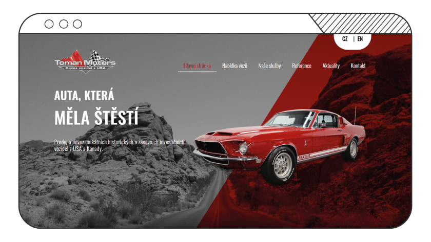
WEB REDESIGN FOR TOMAN MOTORS
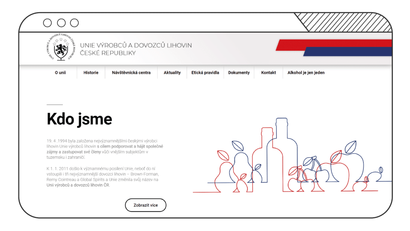
WEB REDESIGN FOR UVDL
The original website of the Union of Spirits Producers and Importers allowed only minimal modifications and served more as a space for publishing press releases and news. Therefore, we modified the newly developed website to ensure its smooth operation, and supplemented everything with even more interactive elements for a more dynamic appearance of the site.
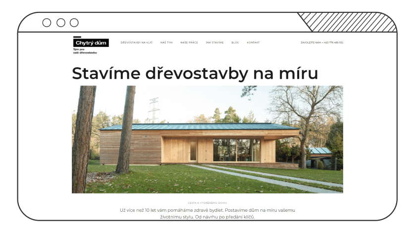
WEB REDESIGN FOR CHYTRÝ DŮM
Visuals come first - this was the assignment of a client whose original website did not meet this condition. We therefore conceived the new website for wooden building builders in a very minimalist and clean spirit, which not only fits the client's visual identity, but also gets the most important information to potential customers quickly and easily.
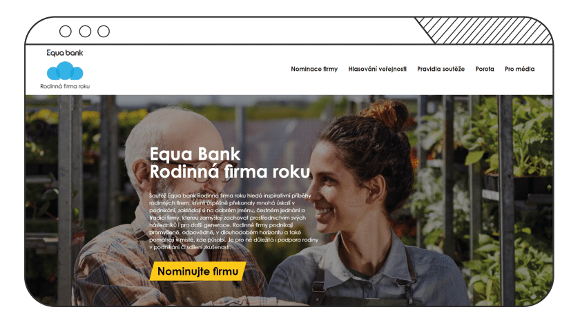
WEBSITE FOR EQUA BANK COMPETITION
We have created a new website of the Family Company of the Year competition for the banking company Equa bank. The new website combines simple and modern design and its key functionality is a database that allows not only counting votes, but also more complex operations with a list of competitors.
WEB PRO NADAČNÍ FOND MUŽI PROTI RAKOVINĚ
Zdraví, to nevočůráš. Na to již druhým rokem upozorňujeme Movemberovou kampaní věnovanou prevenci rakoviny prostaty a varlat. Hlavní cíl webu byl jasný: dostat muže na preventivní prohlídky k urologům. Drzý claim jsme podtrhli výraznými žluto-černými prvky a obsah odlehčili originálními ilustracemi.


